CIs for Spearman’s rho and Kendall’s tau

There are various methods for obtaining CIs for Kendall’s tau and Spearman’s rho. As the underlying data are unlikely to be bivariate normal (or else Pearson’s r would be used) bootstrapping is often recommended – but it doesn’t always perform that well (Bishara & Hittner, 2017). One could also use a Fisher z transformation. This makes intuitive sense for rho because it is equivalent to Pearson’s r following a rank transformation. However, the Fisher z transformation isn’t ideal here because ranks will have a rather flat, leptokurtotic distribution relative to data sampled from a bivariate normal distribution. It turns out there are some simple corrections that have good properties in these cases.

Fieller et al. (1957) proposed corrections to the Fisher z standard error for both tau and rho that are recommended for absolute values of rho or tau of up to 0.8. Bonett and Wright (2000) propose an alternative correction for rho (though the results are very similar).

Bishara and Hittner (2017) compare the approaches for rho and find that the Fieller correction and a correction using the rankit transformation (scaling the ranks from 0 to 1 and apply a probit transformation; equivalent to estimating the normal quantiles as one might for a quantile-quantile plot) works well. However, they note that other simulation studies favour the Bonett-Wright correction.

The follow R code snippet implements these corrections for – requiring the observed tau or rho and N (numbers of paired observations) or, for the rankit transformation, raw data as input: e.g., rho.ci(.63, 35) or spearman.test(x_vector, y_vector):

Code snippet for rho and tau CIs

References

Bishara, A. J., Hittner, J. B. (2017). Confidence intervals for correlations when data are not normal. Behavioral Research Methods, 49, 294–309 . https://doi.org/10.3758/s13428-016-0702-8

Bonett, D. G., & Wright, T. A. (2000). Sample size requirements for estimating Pearson, Kendall and Spearman correlations. Psychometrika, 65, 23–28.

Fieller, E. C., Hartley, H. O., & Pearson, E. S. (1957). Tests for rank correlation coefficients: I. Biometrika, 44, 470–481.

Near-instant high quality graphs in R

One of the main attractions of R (for me) is the ability to produce high quality graphics that look just the way you want them to. The basic plot functions are generally excellent for exploratory work and for getting to know your data. Most packages have additional functions for appropriate exploratory work or for summarizing and communicating inferences. Generally the default plots are at least as good as other (e.g., commercial packages) but with the added advantage of being fairly easy to customize once you understand basic plotting functions and parameters.

Even so, getting a plot looking just right for a presentation or publication often takes a lot of work using basic plotting functions. One reason for this is that constructing a good graphic is an inherently difficult enterprise, one that balances aesthetic factors and statistical factors and that requires a good understanding of who will look at the graphic, what they know, what they want to know and how they will interpret it. It can takes hours – maybe days – to get a graphic right.

In Serious Stats I focused on exploratory plots and how to use basic plotting functions to customize them. I think this was important to include, but one of my regrets was not having enough space to cover a different approach to plotting in R. This is Hadley Wickham’s ggplot2 package (inspired by Leland Wilkinson’s grammar of graphics approach).

In this blog post I’ll quickly demonstrate a few ways that ggplot2 can be used to quickly produce amazing graphics for presentations or publication. I’ll finish by mentioning some pros and cons of the approach.

The main attraction of ggplot2 for newcomers to R is the qplot() quick plot function. Like the R plot() function it will recognize certain types and combinations of R objects and produce an appropriate plot (in most cases). Unlike the basic R plots the output tends to be both functional and pretty. Thus you may be able to generate the graph you need for your talk or paper almost instantly.

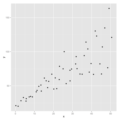
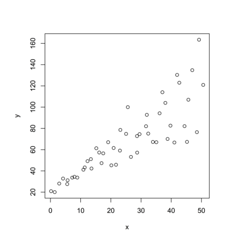
A good place to start is the vanilla scatter plot. Here is the R default:

Scatter default in R

Compare it with the ggplot2 default:

Scatter with ggplot2 default

Below is the R code for comparison. (The data here are from hov.csv file used in Chapter 10 Example 10.2 of Serious Stats).

# install and then load the package
install.packages('ggplot2')
library(ggplot2)

# get the data
hov.dat <-  read.csv('http://www2.ntupsychology.net/seriousstats/hov.csv')

# using plot()
with(hov.dat, plot(x, y))

# using qplot()
qplot(x, y, data=hov.dat)

R code formatted by Pretty R at inside-R.org

Adding a line of best fit

The ggplot2 version is (in my view) rather prettier, but a big advantage is being able to add a range of different model fits very easily. The common choice of model fit is that of a straight line (usually the least squares regression line). Doing this in ggplot2 is easier than with basic plot functions (and you also get 95% confidence bands by default).

Here is the straight line fit from a linear model:

Linear modelPOST

qplot(x, y, data=hov.dat, geom=c(‘point’, ‘smooth’), method=’lm’)

The geom specifies the type of plot (one with points and a smoothed line in this case) while the method specifies the model for obtaining the smoothed line. A formula can also be added (but the formula defaults to y as a simple linear function of x).

Loess, polynomial fits or splines

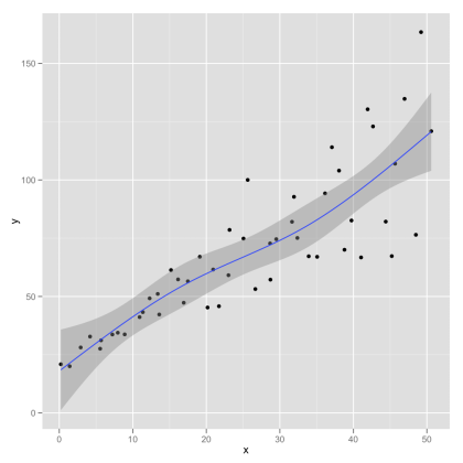
Mind you, the linear model fit has some disadvantages. Even if you are working with a related statistical model (e.g., a Pearson’s r or least squares simple or multiple regression) you might want to have a more data driven plot. A good choice here is to use a local regression approach such as loess. This lets the data speak for themselves – effectively fitting a complex curve driven by the local properties of the data. If this is reasonably linear then your audience should be able to see the quality of the straight-line fit themselves. The local regression also gives approximate 95% confidence bands. These may support informal inference without having to make strong assumptions about the model.

Here is the loess plot:

loess plot.png

Here is the code for the loess plot:

qplot(x, y, data=hov.dat, geom=c(‘point’, ‘smooth’), method=’loess’)

I like the loess approach here because its fairly obvious that the linear fit does quite well. showing the straight line fit has the appearance of imposing the pattern on the data, whereas a local regression approach illustrates the pattern while allowing departures from the straight line fit to show through.

In Serious Stats I mention loess only in passing (as an alternative to polynomial regression). Loess is generally superior as an exploratory tool – whereas polynomial regression (particularly quadratic and cubic fits) are more useful for inference. Here is an example of a cubic polynomial fit (followed by R code):

cubic fit.png

qplot(x, y, data=hov.dat, geom=c(‘point’, ‘smooth’), method=’lm’, formula= y ~ poly(x, 2))

Also available are fits using robust linear regression or splines. Robust linear regression (see section 10.5.2 of Serious Stats for a brief introduction) changes the loss function least squares in order to reduce impact of extreme points. Sample R code (graph not shown):

library(MASS)
qplot(x, y, data=hov.dat, geom=c(‘point’, ‘smooth’), method=’rlm’)

One slight problem here is that the approximate confidence bands assume normality and thus are probably too narrow.

Splines are an alternative to loess that fits sections of simpler curves together. Here is a spline with three degrees of freedom:

spline fit 3.png

library(splines)
qplot(x, y, data=hov.dat, geom=c(‘point’, ‘smooth’), method=’lm’, formula=y ~ ns(x, 3))

A few final thoughts

If you want to know more the best place to start is with Hadley Wickham’s book. Chapter 2 covers qplot() and is available free online.

The immediate pros of the ggplot2 approach are fairly obvious – quick, good-looking graphs. There is, however, much more to the package and there is almost no limit to what you can produce. The output of the ggplot2 functions is itself an R object that can be stored and edited to create new graphs. You can use qplot() to create many other graphs – notably kernel density plots, bar charts, box plots and histograms. You can get these by changing the geom (or by default with certain object types an input).

The cons are less obvious. First, it takes some time investment to get to grips with the grammar of graphics approach (though this is very minimal if you stick with the quick plot function). Second, you may not like the default look of the ggplot2 output (though you can tweak it fairly easily). For instance, I prefer the default kernel density and histogram plots from the R base package to the default ggplot2 ones. I like to take a bare bones plot and build it up … trying to keep visual clutter to a minimum. I also tend to want black and white images for publication (whereas I would use grey and colour images more often in presentations). This is mostly to do with personal taste.

Beware the Friedman test!

In section 10.4.4 of Serious stats (Baguley, 2012) I discuss the rank transformation and suggest that it often makes sense to rank transform data prior to application of conventional ‘parametric’ least squares procedures such as tests or one-way ANOVA. There are several advantages to this approach over the usual approach (which involves learning and applying a new test such as Mann-Whitney U, Wilcoxon T or Kruskal-Wallis for almost every situation). One is pedagogic. It is much easier to teach or learn the rank transformation approach (especially if you also cover other transformations in your course). Another reason is that there are situations where widely used rank-randomization tests perform very badly, yet the rank transformation approach does rather well. In contrast, Conover and Iman (1981) show that rank transformation versions of parametric tests mimic the properties of the best known rank randomization tests (e.g., Spearman’s rho, Mann-Whitney U or Wilcoxon T) rather closely with moderate to large sample sizes. The better rank randomization tests tend to have the edge on rank transformation approaches only when sample sizes are small (and that advantage may not hold if there are many ties).

The potential pitfalls of rank randomization tests is nicely illustrated with the case of the Friedman test (and related tests such as Page’s L). I’ll try and explain the problem here.

Why the Friedman test is an impostor …

I’ve always thought there was something odd about the way the Friedman test worked. Like most psychology students I first learned the Wilcoxon signed ranks (T) test. This is a rank randomization analog of the paired test. It involves computing the absolute difference between paired observations, ranking them and then adding the original sign back in. Imagine that the raw data consist of the following paired measurements (A and B) from four people (P1 to P4):

A B
P1 13 4
P2 6 9
P3 11 9
P4 12 6

This results in the following ranks being assigned:

A – B Rank
P1 +9 +4
P2 -3 -2
P3 +2 +1
P4 +6 +3

The signed ranks are then used as input to a randomization (i.e., permutation) test that, if there are no ties, gives the exact probability of the observed sum of the ranks (or a sum more extreme) being obtained if the paired observations had fallen into the categories A or B at random (in which case the expected sum is zero). The basic principle here is similar to the paired t test (which is a one sample t test on the raw differences).

The Friedman test is (incorrectly) generally considered to be a rank randomization equivalent of one-way repeated measures (within-subjects) ANOVA in the same way that the Wilcoxon test is a  a rank randomization equivalent of paired t. It isn’t. To see why, consider three repeated measures (A, B and C) for two participants.  Here are the raw scores:

A B C
P1 6 7 12
P2 8 5 11

Here are the corresponding ranks:

A B C
P1 1 2 3
P2 2 1 3

The ranks for the Friedman test depend only on the order of scores within each participant – they completely ignore the differences between participants. This differs dramatically from the Wilcoxon test where information about the relative size of differences between participants is preserved. Zimmerman and Zumbo (1993) discuss this difference in procedures and explain that the Friedman test (devised by the noted economist and champion of the ‘free market’ Milton Friedman) is not really a form of ANOVA but an extension of the sign test. It is an impostor.

This is bad news because the sign test tends to have low power relative to the paired t test or Wilcoxon sign rank test. Indeed, the asymptotic relative efficiency relative to ANOVA of the Friedman test is .955 J/(J+1) where J is the number of repeated measures (see Zimmerman & Zumbo, 1993). Thus it is about .72 for J = 3 and .76 for J = 4, implying quite a big hit in power relative to ANOVA when the assumptions are met. This is a large sample limit, but small samples should also have considerably less power because the sign test and the Friedman test, in effect, throw information away. The additional robustness of the sign test may sometimes justify its application (as it may outperform Wilcoxon for heavy-tailed distributions), but this does not appear to be the case for the Friedman test. Thus, where one-way repeated measures ANOVA is not appropriate, rank transformation followed by ANOVA will provide a more robust test with greater statistical power than the Friedman test.

Running one-way repeated measures ANOVA with a rank transformation in R

The rank transformation version of the ANOVA is relatively easy to set up. The main obstacle is that the ranks need to be derived by treating all nJ scores as a single sample (where n is the number of observations per J repeated measures conditions – usually the number of participants). If your software arranges repeated measures data in broad format (e.g., as in SPSS) this can involve some messing about cutting and pasting columns and then putting them back (for which I would use Excel). For this sort of analysis I would in case prefer R – in which case the data would tend to be in a single column of a data frame or in a single vector anyway.

The following R code using demo data from the excellent UCLA R resources runs first a friedman test, then a one-way repeated measures ANOVA and then the rank transformation version ANOVA. For these data pulse is the DV, time is the repeated measures factor and id is the subjects identifier.

demo3 <- read.csv("http://stats.oarc.ucla.edu/stat/data/demo3.csv")

friedman.test(pulse ~ time|id, demo3)

library(nlme)
lme.raw <- lme(fixed = pulse ~ time, random =~1|id, data=demo3)
anova(lme.raw)

rpulse <- rank(demo3$pulse)
lme.rank <- lme(fixed = rpulse ~ time, random =~1|id, data=demo3)
anova(lme.rank)

It may be helpful to point out  a couple of features of the R code. The Friedman test is built into R and can take formula or matrix input. Here I used formula input and specified a data frame that contains the demo data. The vertical bar notation indicates that the time factor varies within participants. The repeated measures ANOVA can be run in many different ways (see Chapter 16 of Serious stats ). Here I chose ran it as a multilevel model using the nlme package (which should still work even if the design is unbalanced). As you can see, the only difference between the code for the conventional ANOVA and the rank transformation version is that the DV is rank transformed prior to analysis.

Although this example uses R, you could almost as easily use any other software for repeated measures ANOVA (though as noted it is simplest with software that take data structured in long form – with the DV in a single column or vector).

Other advantages of the approach

The rank transformation is, as a rule, more versatile than using rank randomization tests. For instance, ANOVA software often has options for testing contrasts or correcting for multiple comparisons. Although designed for analyses of raw data some procedures are very general and can be straightforwardly applied to the rank transformation approach – notably powerful modified Bonferroni procedures such as the Hochberg or Westfall procedures. A linear contrast can also be used to run the equivalent of a rank randomization trend test such as the Jonckheere test (independent measures) or Page’s L (repeated measures). A rank transformation version of the Welch-Satterthwaite t test is also superior to the more commonly applied Mann-Whitney U test (being robust to homogeneity of variance when sample sizes are unequal which the Mann-Whitney U test is not).

References

Baguley, T. (2012, in press). Serious stats: A guide to advanced statistics for the behavioral sciences. Basingstoke: Palgrave.

Conover, W. J., & Iman, R. L. (1981). Rank transformations as a bridge between parametric and nonparametric statistics. American Statistician, 35, 124-129.

Zimmerman, D. W., & Zumbo, Bruno, D. (1993). Relative power of the Wilcoxon test, the Friedman test, and repeated-measures ANOVA on ranks. Journal of Experimental Education, 62, 75-86.

N.B.  R code formatted via Pretty R at inside-R.org
Comparing correlations: independent and dependent (overlapping or non-overlapping)

In Chapter 6 (correlation and covariance) I consider how to construct a confidence interval (CI) for the difference between two independent correlations.  The standard approach uses the Fisher z transformation to deal with boundary effects (the squashing of the distribution and increasing asymmetry as r approaches -1 or 1). As zr is approximately normally distributed (which r is decidedly not) you can create a standard error for the difference by summing the sampling variances according to the variance sum law (see chapter 3).

This works well for the CI around a single correlation (assuming the main assumptions – bivariate normality and homogeneity of variance – broadly hold) or for differences between means, but can perform badly when looking at the difference between two correlations. Zou (2007) proposed modification to the standard approach that uses the upper and lower bounds of the CIs for individual correlations to calculate a CI for their difference. He considered three cases: independent correlations and two types of dependent correlations (overlapping and non-overlapping). He also considered differences in R2 (not relevant here).

Independent correlations

In section 6.6.2 (p. 224) I illustrate Zou’s approach for independent correlations and provide R code in sections 6.7.5 and 6.7.6 to automate the calculations. Section 6.7.5 shows how to write a simple R function and illustrates it with a function to calculate a CI for Pearson’s r using the Fisher transformation. Whilst writing the book I encountered several functions do do exactly this. The cor.test() function in the base package does this for raw data (along with computing the correlation and usual NHST). A number of functions compute it using the usual text book formula. My function relies on R primitive hyperbolic functions (as the Fisher z transformation is related to the geometry of hyperbolas), which may be useful if you need to use it intensively (e.g., for simulations):

rz.ci <- function(r, N, conf.level = 0.95) {
    zr.se <- 1/(N - 3)^0.5
    moe <- qnorm(1 - (1 - conf.level)/2) * zr.se
    zu <- atanh(r) + moe
    zl <- atanh(r) - moe
    tanh(c(zl, zu))
}

The function is 6.7.6 uses the rz.ci() function to construct a CI for the difference between two independent correlations. See section 6.6.2 of Serious stats or Zou (2007) for further details and a worked example. My function from section 6.7.6 is reproduced here:

r.ind.ci <- function(r1, r2, n1, n2=n1, conf.level = 0.95) {
    L1 <- rz.ci(r1, n1, conf.level = conf.level)[1]
    U1 <- rz.ci(r1, n1, conf.level = conf.level)[2]
    L2 <- rz.ci(r2, n2, conf.level = conf.level)[1]
    U2 <- rz.ci(r2, n2, conf.level = conf.level)[2]
    lower <- r1 - r2 - ((r1 - L1)^2 + (U2 - r2)^2)^0.5
    upper <- r1 - r2 + ((U1 - r1)^2 + (r2 - L2)^2)^0.5
    c(lower, upper)
}

The call the function use the two correlation coefficients an sample as input (the default is to assume equal n and a 95% CI).

A caveat

As I point out in chapter 6, just because you can compare two correlation coefficients doesn’t mean it is a good idea. Correlations are standardized simple linear regression coefficients and even if the two regression coefficients measure the same effect, it doesn’t follow that their standardized counterparts do. This is not merely the problem that it may be meaningless to compare, say, a correlation between height and weight with a correlation between anxiety and neuroticism. Two correlations between the same variables in different samples might not be meaningfully comparable (e.g., because of differences in reliability, range restriction and so forth).

Dependent overlapping correlations

In many cases the correlations you want to compare aren’t independent. One reason for this is that the correlations share a common variable. For example if you correlate X with Y and X with Z you might be interested in whether the correlation rXY is larger than rXZ. As X is common to both variables the correlations are not independent. Zou (2007) describes how to adjust the interval to account for this correlation. In essence the sampling variances of the correlations are tweaked using a version of the variance sum law (again see chapter 3).

The following functions (not in the book) compute the correlation between the correlations and use it to adjust the CI for the difference in correlations to account for overlap (a shared predictor). Note that both functions and  rz.ci() must be loaded into R. Also included is a calls to the main function  that reproduces the output from example 2 of Zou (2007).

rho.rxy.rxz <- function(rxy, rxz, ryz) {
	num <- (ryz-1/2*rxy*rxz)*(1-rxy^2-rxz^2-ryz^2)+ryz^3
	den <- (1 - rxy^2) * (1 - rxz^2)
	num/den
	}

r.dol.ci <- function(r12, r13, r23, n, conf.level = 0.95) {
    L1 <- rz.ci(r12, n, conf.level = conf.level)[1]
    U1 <- rz.ci(r12, n, conf.level = conf.level)[2]
    L2 <- rz.ci(r13, n, conf.level = conf.level)[1]
    U2 <- rz.ci(r13, n, conf.level = conf.level)[2]
    rho.r12.r13 <- rho.rxy.rxz(r12, r13, r23)
    lower <- r12-r13-((r12-L1)^2+(U2-r13)^2-2*rho.r12.r13*(r12-L1)*(U2- r13))^0.5
    upper <- r12-r13+((U1-r12)^2+(r13-L2)^2-2*rho.r12.r13*(U1-r12)*(r13-L2))^0.5
    c(lower, upper)
} 

# input from example 2 of Zou (2007, p.409)
r.dol.ci(.396, .179, .088, 66)

The r.dol.ci() function takes three correlations as input – the correlations of interest (e.g., rXY and rXZ) and the correlation between the non-overlapping variables (e.g., rYZ). Also required is the sample size (often identical for both correlations).

Dependent non-overlapping correlations

Overlapping correlations are not the only cause of dependency between correlations. The samples themselves could be correlated. Zou (2007) gives the example of a correlation between two variables for a sample of mothers. The same correlation could be computed for their children. As the children and mothers have correlated scores on each variable, the correlation between the same two variables will be correlated (but not overlapping in the sense used earlier). The following functions compute the CI for the difference in correlations  between dependent non-overlapping correlations. Also included is a call to the main function that reproduces Zou (2007) example 3.

rho.rab.rcd <- function(rab, rac, rad, rbc, rbd, rcd) {
	num <- 1/2*rab*rcd * (rac^2 + rad^2 + rbc^2 + rbd^2) + rac*rbd + rad*rbc - (rab*rac*rad + rab*rbc*rbd + rac*rbc*rcd + rad*rbd*rcd)
	den <- (1 - rab^2) * (1 - rcd^2)
	num/den
	}

r.dnol.ci <- function(r12, r13, r14, r23, r24, r34, n12, n34=n12, conf.level=0.95) {
    L1 <- rz.ci(r12, n12, conf.level = conf.level)[1]
    U1 <- rz.ci(r12, n12, conf.level = conf.level)[2]
    L2 <- rz.ci(r34, n34, conf.level = conf.level)[1]
    U2 <- rz.ci(r34, n34, conf.level = conf.level)[2]
    rho.r12.r34 <- rho.rab.rcd(r12, r13, r14, r23, r24, r34)
    lower <- r12 - r34 - ((r12 - L1)^2 + (U2 - r34)^2 - 2 * rho.r12.r34 * (r12 - L1) * (U2 - r34))^0.5
    upper <- r12 - r34 + ((U1 - r12)^2 + (r34 - L2)^2 - 2 * rho.r12.r34 * (U1 - r12) * (r34 - L2))^0.5
    c(lower, upper)
} 

# from example 3 of Zou (2007, p.409-10)

r.dnol.ci(.396, .208, .143, .023, .423, .189, 66)

Although this call reproduces the final output for example 3 it produces slightly different intermediate results (0.0891 vs. 0.0917) for the correlation between correlations. Zou (personal communication) confirms that this  is either a typo or rounding error (e.g., arising from hand calculation) in example 3 and that the function here produces accurate output. The input here requires the correlations from every possible correlation between the four variables being compared (and the relevant sample size for the correlations being compared). The easiest way to get the correlations is from a correlation matrix of the four variables.

Robust alternatives

Wilcox (2009) describes a robust alternative to these methods for independent correlations and modifications to Zou’s  method that make the dependent correlation methods robust to violations of bivariate normality and (in particular) homogeneity of variance assumptions. Wilcox provides R functions for these approaches that can be installed via this link. His functions take raw data as input and are computationally intensive. For instance the dependent correlation methods use Zou’s approach but take boostrap CIs for the individual correlations as input (rather than the simpler Fisher z transformed versions).

The relevant functions are twopcor() for the independent case, TWOpov() for the dependent overlapping case and TWOpNOV() for the non-overlapping case.

UPDATE

Zou’s modified asymptotic method is easy enough that you can run it in Excel. I’ve added an Excel spreadsheet to the blog resources that should implement the methods (and matches the output to R fairly closely). As it uses Excel it may not cope gracefully with some calculations (e.g., with extremely small or large values or r or other extreme cases) – and I have more confidence in the R code.

References

Baguley, T. (2012, in press). Serious stats: A guide to advanced statistics for the behavioral sciences. Basingstoke: Palgrave.

Zou, G. Y. (2007). Toward using confidence intervals to compare correlations. Psychological Methods, 12, 399-413.

Wilcox, R. R. (2009). Comparing Pearson correlations: Dealing with heteroscedascity and non-normality. Communications in Statistics – Simulation & Computation, 38, 2220-2234.

N.B. R code formatted via Pretty R at inside-R.org