MANOVA

In Serious Stats there is a short section on MANOVA (pp 647-650). I summarised my views on MANOVA based largely on that section on my other blog: http://psychologicalstatistics.blogspot.com/2021/08/i-will-not-ever-never-run-manova.html.

It also references a recent paper on MANOVA and alternatives to MANOVA that is worth reading. In addition I’d refer readers to the multivariate regression options in the R package brms: http://cran.r-project.org/web/packages/brms/vignettes/brms_multivariate.html. This isn’t covered in Serious Stats (indeed brms didn’t exist at that time) but would definitely be added if I was writing it now.

CIs for Spearman’s rho and Kendall’s tau

There are various methods for obtaining CIs for Kendall’s tau and Spearman’s rho. As the underlying data are unlikely to be bivariate normal (or else Pearson’s r would be used) bootstrapping is often recommended – but it doesn’t always perform that well (Bishara & Hittner, 2017). One could also use a Fisher z transformation. This makes intuitive sense for rho because it is equivalent to Pearson’s r following a rank transformation. However, the Fisher z transformation isn’t ideal here because ranks will have a rather flat, leptokurtotic distribution relative to data sampled from a bivariate normal distribution. It turns out there are some simple corrections that have good properties in these cases.

Fieller et al. (1957) proposed corrections to the Fisher z standard error for both tau and rho that are recommended for absolute values of rho or tau of up to 0.8. Bonett and Wright (2000) propose an alternative correction for rho (though the results are very similar).

Bishara and Hittner (2017) compare the approaches for rho and find that the Fieller correction and a correction using the rankit transformation (scaling the ranks from 0 to 1 and apply a probit transformation; equivalent to estimating the normal quantiles as one might for a quantile-quantile plot) works well. However, they note that other simulation studies favour the Bonett-Wright correction.

The follow R code snippet implements these corrections for – requiring the observed tau or rho and N (numbers of paired observations) or, for the rankit transformation, raw data as input: e.g., rho.ci(.63, 35) or spearman.test(x_vector, y_vector):

Code snippet for rho and tau CIs

References

Bishara, A. J., Hittner, J. B. (2017). Confidence intervals for correlations when data are not normal. Behavioral Research Methods, 49, 294–309 . https://doi.org/10.3758/s13428-016-0702-8

Bonett, D. G., & Wright, T. A. (2000). Sample size requirements for estimating Pearson, Kendall and Spearman correlations. Psychometrika, 65, 23–28.

Fieller, E. C., Hartley, H. O., & Pearson, E. S. (1957). Tests for rank correlation coefficients: I. Biometrika, 44, 470–481.

Type II and Type III sums of squares: What should I choose?

The choice between Type II and Type III sums of squares in ANOVA and ANOVA-like models is a pretty obscure topic, but potentially important. I’m a little surprised that I only devote one page to it in Serious Stats (but that’s maybe a good thing). What’s the issue? The question arises when one has an ANOVA like model involving main effects of factors and their interactions. These models are all about partitioning variance into difference sources.

If a source of variation associated with an effect is large relative to an estimate of the expected variation in a model with no effect (i.e., relative to the appropriate estimate of error variance) then we are likely to conclude that there is an effect. For this to work nicely the variances have to be cleanly partitioned. This is almost trivial in a balanced design with no covariates because all the effects are independent (assuming you have parameterised the model in an ANOVA-like way – for example through effect coding). However, if you have an unbalanced design the effects the sums of squares (SS) could be partitioned in more than one way.

The main options are sequential (Type I), hierarchical (Type II) and unique (Type III) SS. Sequential SS is in arguably the most fundamental approach and preferred by purists because it involves deciding what statistical question you want to address and entering terms in sequence and partitioning according to the difference in SS explained by adding the effect to the existing model. This is approach advocated by Nelder (e.g., Nelder and Lane, 1997). The main draw back is that it fails as a useful default practice (and hence as a default for software). In addition, you can reproduce the behaviour of both hierarchical and unique SS through sequential SS if you wish.

Hierarchical (Type II) involves comparing the change in SS to a model with all other effects of equal or lower order (e.g., three-way interactions, two-way interactions and main effects). Unique SS (Type III) compares SS with a model containing all other effects (regardless of order). The two are therefore equivalent in a model with no interactions or if it is completely balanced. However, they lead to potentially different outcomes if you test a main effect in a model with interactions (or a k-1 -way interactions in a model with -way interactions). Imagine a model with two factors: A and B. Do I test the effect of A against a model with B but not AxB or a model with B and AxB? This is a source of surprising controversy and arouses strong emotions among some statisticians.

If you only ever have balanced designs (or indeed near balanced designs) or don’t test interactions you don’t really need to worry about this too much (and you can probably stop reading now). However, every now and again it will matter and it is useful to consider what the best approach is.

The fundamental source of the controversy (or at least the passions roused by it) is probably the decision to implement unique (Type III) SS as the default in SAS and SPSS (and probably other software, but SPSS seem to have copied SAS thereby making this solution the ‘correct’ solution for a whole generation of scientists educated in the heyday of SPSS).

The main criticism of unique (Type III) SS is that it doesn’t respect the marginality principle. This is the principle that you can’t interpret higher order effects in models without the corresponding lower order effects: a model of the form Y ~ 1 + A + AxB is arguably inherently meaningless. Nelder and Lane write: “Neglect of marginality relations leads to the introduction of hypotheses that, although well defined mathemati- cally, are, we assert, of no inferential interest.” (This is one of the politer things that have been written about Type III SS by Nelder and others).

What about the practicalities? In Serious Stats I cited Langsrud (2003) and mentioned in passing that hierarchical (Type II) SS tends to have greater statistical power. However, I have read claims that unique (Type III) SS has greater power (though I have lost the reference). This issue is examined in further detail in a very accessible paper by Smith and Cribbie (2014). Generally hierarchical (Type II) SS has greater statistical power where you most want to test the main effects and therefore is the most appropriate default:

If there is no evidence of an interaction, either by way of significant hypothesis tests or effect sizes […] one of three eventualities has unfolded: (1) no interaction was detected because none exists in the population in question. In this circumstance the Type II method is definitively more powerful and we will necessarily lose power by electing to use the Type III method instead. (2) A very small interaction exists in the population, in which case it is not definitive which method will provide for the best statistical power for main effects. (3) A large interaction exists in the population but we have been extremely unfortunate in selecting a sample that does not evidence it. In this case the Type III method may hold better statistical power, but in this unfortunate situation the main effects will be of dubious value anyway. As Stewart-Oaten (1995, p.2007) quipped “the Type III SS is ‘obviously’ best for main effects only when it makes little sense to test main effects at all”. [Smith & Cribbie 2014), p.399]

While this discussion focused on SS in ANOVA models the same considerations arise in generalized linear and related models that have an aNOVA-like design. Here we are generally interested in partitioning deviance in the model (-2logL). The marginality principle still applies here and one should adopt hierarchical (Type II) SS as the default. For R users this is probably easiest to do using the drop1() function which implements the marginality principle or (for models that take a long time to refit) using anova() to compare the two models of interest for each effect.

References

Langsrud, Ø. (2003). ANOVA for unbalanced data: Use Type II instead of Type III sums of squares. Statistics and Computing ,13, 163–167. https://doi.org/10.1023/A:1023260610025

Nelder J. A. & Lane P. W. (1995). The computer analysis of factorial experiments: In memoriam – Frank Yates. The American Statistician, 49: 382–385.

Smith, C. E., Cribbie, R. (2014). Factorial ANOVA with unbalanced data: A fresh look at the types of sums of squares. Journal of Data Science, 12: 385-404.

Chi-Square and the Egon Pearson correction

Looking back at the coverage of the Chi-Square test of independence in the book there are a couple of things I wish I’d gone into greater depth on. First, resolving the debate on the appropriate way to handle small expected values in the test of independence. Second, expanding on residual analysis.

First, the issue of small expected values. Generally it is well known that the Pearson test of independence performs pretty well with moderate to large N and most expected values over 5 (generally people advise 80% of cells with expected values greater than 5). However, simulations by Campbell (2007) suggest that a simple correction first proposed by Egon Pearson (son of Karl Pearson – who the Chi-square test is associated with). This correction simply multiplies the test statistic by (N-1)/N with unchanged degrees of freedom. This procedure performs well even for relatively small values of N provided expected values are greater than 1. This covers most useful applications of Chi-square (and underlines that with large N the uncorrected test is generally going to be OK). If you have expected values lower than 1 then some form of exact test might be appropriate. However, the real problem in this case is that there is very sparse information for some cells and hence low statistical power. My present intuition is that this might lend itself to a Bayesian approach adding informative or weakly informative priors.

Second, I covered standardized residuals in the book but recently discovered that the classical Pearson residual does not have great distributional properties and is somewhat conservative when used for testing. Furthermore at least two quantities are referred to in the literature as standardized residuals. One of these – which I prefer to term the adjusted standardized residual (ASR) is generally recommended if you are following up a contingency table analysis (see Agresti, 2007). For large tables using the ASR could run into multiple testing issues so I’d recommend a correction such as the Holm or Hommel test. If you have specific hypotheses to test about patterns within the contingency table I’d recommend a different approach such as a log linear model or count model (such as Poisson on negative binomial regression).

Although the Egon Pearson N-1 Chi-square test is easy to calculate, getting exact p values is fiddly so I have implemented this in R (see Egon Pearson Chi-Square test with residual analyses). This R function also outputs standardized residuals and ASRs (the latter with p values adjusted for multiple testing by default).

Ian Campbell also provides a very easy to use calculator here. He also notes that Bruce Weaver and colleagues have discovered that the Egon Pearson corrected test is equivalent to the linear-by-linear association test provided in SPSS (and possibly other software).

References

Agresti, A. (2007), An Introduction to Categorical Data Analysis, 2nd Ed, New York: John Wiley &Sons.


Campbell I. (2007), Chi-squared and Fisher-Irwin tests of two-by-two tables with small sample recommendations, Statistics in Medicine, 26, 3661 – 3675


VIF and multicollinearity diagnostics

In the book I use the car package to get VIF and other multicollinearity diagnostics. I’ve occasionally found this breaks down (usually through mixing different versions of R on different machines at work home or on the move). I recently saw the mctest package and thought it would be useful to use that as a backup – and also because it offers a slightly different set of diagnostics.

If you’d like to try it out I’ve written a helper function that makes it easier apply directly to a linear model. You can find the function and a simple example here.


CI for difference between independent R square coefficients

In an earlier blog post I provided R code for a CI of a difference in R square for dependent and non-dependent correlations. This was based on a paper by Zou (2007). That paper also provides a method for calculating the CI of a difference in independent R square coefficients based on the limits of the CI for a single R square coefficient. I’ve also been experimenting with knitr and unfortunately haven’t yet worked out how to merge the R markdown output with my blog template, so I’m linking to RPubs for convenience.

You can find the function and a few more details here.

Multicollinearity tutoral

I just posted brief multicollinearity tutorial on my other blog (loosely based on the material from the Serious Stats book).

You can read it here.

A gentle introduction to learning R

There are many good resources online for learning R. However, I recently discovered Try R from Code school – which is interactive, goes at a very gentle pace and also looks very pretty:

http://tryr.codeschool.com/

Using multilevel models to get accurate inferences for repeated measures ANOVA designs

It is now increasingly common for experimental psychologists (among others) to use multilevel models (also known as linear mixed models) to analyze data that used to be shoe-horned into a repeated measures ANOVA design. Chapter 18 of Serious Stats introduces multilevel models by considering them as an extension of repeated measures ANOVA models that can cope with missing outcomes, time-varying covariates and can relax the sphericity assumption of conventional repeated measures ANOVA. They can also deal with other – less well known – problems such as having stimuli that are random factor (e.g., see this post on my Psychological Statistics blog). Last, but not least, multilevel generalised linear models allow you to have discrete and bounded outcomes (e.g., dichotomous, ordinal or count data) rather than be constrained by as assuming a continuous response with normal errors.

There are two main practical problems to bear in mind when switching to the multilevel approach. First, the additional complexity of the approach can be daunting at first – though it is possible to built up gently to more complex models. Recent improvements in availability of software and support (textbooks, papers and online resources) also help. The second is that as soon as a model departs markedly from a conventional repeated measures ANOVA, correct inferences (notably significance tests and interval estimates such as confidence intervals) can be difficult to obtain. If the usual ANOVA assumptions hold in a nested, balanced design then there is a known equivalence between the multilevel model inferences using t or F tests and the familiar ANOVA tests (and this case the expected output of the tests is the same). The main culprits are boundary effects (which effect inferences about variances and hence most tests of random effects) and working out the correct degrees of freedom (df) to use for your test statistic. Both these problems are discussed in Chapter 18 of the book. If you have very large samples an asymptotic approach (using Wald z or chi-square statistics) is probably just fine. However, the further you depart from conventional repeated measures ANOVA assumptions the harder it is to know how large a sample news to be before the asymptotics kick in. In other words, the more attractive the multilevel approach the less you can rely on the Wald tests (or indeed the Wald-style t or F tests).

The solution I advocate in Serious Stats is either to use parametric bootstrapping or Markov chain Monte Carlo (MCMC) approaches. Another approach is to use some form of correction to the df or test statistic such as the Welch-Satterthwaite correction. For multilevel models with factorial type designs the recommended correction is generally the Kenward-Roger approximation. This is implemented in SAS, but (until recently) not available in R. Judd, Westfall and Kenny (2012) describe how to use the Kenward-Roger approximation to get more accurate significance tests from a multilevel model using R. Their examples use the newly developed pbkrtest package (Halekoh & Højsgaard, 2012) – which also has functions for parametric bootstrapping.

My purpose here is to contrast the the MCMC and Kenward-Roger correction (ignoring the parametric bootstrap for the moment). To do that I’ll go through a worked example – looking to obtain a significance test and a 95% confidence interval (CI) for a single effect.

The pitch data example

The example I’ll use is for the pitch data from from Chapter 18 of the book. This experiment (from a collaboration with Tim Wells and Andrew Dunn) involves looking at the at pitch of male voices making attractiveness ratings with respect to female faces. The effect of interest (for this example) is whether average pitch goes up or done for higher ratings (and if so, by how much). A conventional ANOVA is problematic because this is a design with two fully crossed random factors – each participant (n = 30) sees each face (n = 32) and any conclusions ought to generalise both to other participants and (crucially) to other faces. Furthermore, there is a time-varying covariate – the baseline pitch of the numerical rating when no face is presented. The significance tests or CIs reported by most multilevel modelling packages with also be suspect. Running the analysis in the R package lme4 gives parameter estimates and t statistics for the fixed effects but no p values or CIs. The following R code loads the pitch data, checks the first few cases, loads lme4 and runs the model of interest. (You should install lme4 using the command install.packages(‘lme4’) if you haven’t done so already).

pitch.dat <- read.csv('http://www2.ntupsychology.net/seriousstats/pitch.csv')

head(pitch.dat)

library(lme4)

pitch.me <- lmer(pitch ~ base + attract + (1|Face) + (1|Participant), data=pitch.dat)

pitch.me

Note the lack of df and p values. This is deliberate policy by the lme4 authors; they are not keen on giving users output that has a good chance of being very wrong.

The Kenward-Roger approximation

This approximation involves adjusting both the F statistic and its df so that the p value comes out approximately correct (see references below for further information). It won’t hurt too much to think of it as turbocharged Welch-Satterthwaite correction. To get the corrected p value from this approach first install the pbkrtest package and then load it. The approximation is computed using the KRmodcomp() function. This takes the model of interest (with the focal effect) and a reduced model (one without the focal effect). The code below installs and loads everything, runs the reduced model and then uses KRmodcomp() to get the corrected p value. Note that it may take a while to run (it took about 30 seconds on my laptop).

install.packages('pbkrtest')
library(pbkrtest)

pitch.red <- lmer(pitch ~ base + (1|Face) + (1|Participant), data=pitch.dat)
KRmodcomp(pitch.me, pitch.red)

The corrected p value is .0001024. The result could reported as a Kenward-Roger corrected test with F(1, 118.5) = 16.17, p = .0001024. In this case the Wald z test would have given a p value of around .0000435. Here the effect is sufficiently large that the difference in approaches doesn’t matter – but that won’t always be true.

The MCMC approach

The MCMC approach (discussed in Chapter 18) can be run in several ways – with the lme4 functions or those in MCMCglmm being fairly easy to implement. Here I’ll stick with lme4 (but for more complex models MCMCglmm is likely to be better).

First you need to obtain a large number of Monte Carlo simulations from the model of interest. I’ll use 25,000 here (but I often start with 1,000 and work up to a bigger sample). Again this may take a while (about 30 or 40 seconds on my laptop).

pitch.mcmc <- mcmcsamp(pitch.me, n = 25000)

For MCMC approaches it is useful to check the estimates from the simulations. Here I’ll take a quick look at the trace plot (though a density plot is also sensible – see chapter 18).

xyplot(pitch.mcmc)

This produces the following plot (or something close to it):
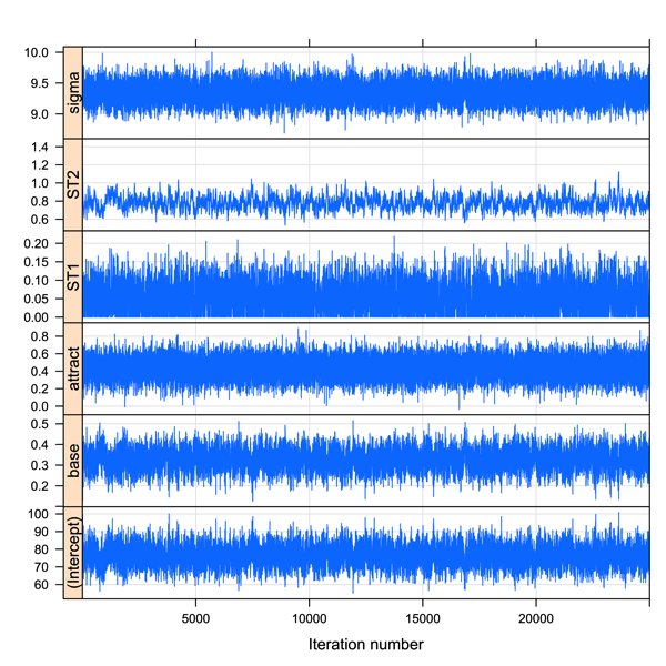
Trace plot for pitch

The trace for the fixed effect of attractiveness looks pretty healthy – the thich black central portion indicating that it doesn’t jump around too much. Now we can look at the 95% confidence interval (strictly a Bayesian highest posterior density or HPD interval – but for present purposes it approximates to a 95% CI).

HPDinterval(pitch.mcmc)

This gives the interval estimate [0.2227276, 0.6578456]. This excludes zero so it is statistically significant (and MCMCglmm would have given an us MCMC-derived estimate of the p value).

Comparison and reccomendation

Although the Kenward-Roger approach is well-regarded, for the moment I would reccomend the MCMC approach. The pbkrtest package is still under development and I could not always get the approximation or the parametric bootstrap to work (but the parametric bootstrap can also be obtained in other ways – see Chapter 18).

The MCMC approach is also preferable in that it should generalize safely to models where the performance of the Kenward-Roger approximation is unknown (or poor) such as for discrete or ordinal outcomes. It also provides interval estimates rather than just p values. The main downside is that you need to familiarize yourself with some basic MCMC diagnostics (e.g., trace and density plots at the very least) and be willing to re-run the simulations to check that the interval estimates are stable.

References

Judd, C. M., Westfall, J., & Kenny, D. A. (2012). Treating stimuli as a random factor in social psychology: A new and comprehensive solution to a pervasive but largely ignored problem. Journal of Personality and Social Psychology, 103, 54-69.

Halekoh, U., & Højsgaard, S. (2012) A Kenward-Roger approximation and parametric bootstrap methods for tests in linear mixed models – the R package pbkrtest. Submitted to Journal of Statistical Software.

Update

Ben Bolker pointed out that future versions of lme4 may well drop the MCMC functions (which are limited, at present, to fairly basic models). In the book I mainly used MCMCglmm – which is rather good at fitting fully crossed factorial models. Here is the R code for the pitch data. Using 50,000 simulations seems to give decent estimates of the attractiveness effect. Plotting the model object gives both MCMC trace plots and kernel density plots of the MCMC estimates (hit return in the console to see all the plots).

nsims <- 50000
pitch.mcmcglmm <- MCMCglmm(pitch ~ base + attract, random= ~ Participant + Face, nitt=nsims, data=pitch.dat)
 
summary(pitch.mcmcglmm)
 
plot(pitch.mcmcglmm)

Last but not least, any one interested in the topic should keep an eye on the draft r-sig-mixed-modelling FAQ for a summary of the challenges and latest available solutions for multilevel inference in R (and other packages).

R code formatted using Pretty R at inside-R.org

Near-instant high quality graphs in R

One of the main attractions of R (for me) is the ability to produce high quality graphics that look just the way you want them to. The basic plot functions are generally excellent for exploratory work and for getting to know your data. Most packages have additional functions for appropriate exploratory work or for summarizing and communicating inferences. Generally the default plots are at least as good as other (e.g., commercial packages) but with the added advantage of being fairly easy to customize once you understand basic plotting functions and parameters.

Even so, getting a plot looking just right for a presentation or publication often takes a lot of work using basic plotting functions. One reason for this is that constructing a good graphic is an inherently difficult enterprise, one that balances aesthetic factors and statistical factors and that requires a good understanding of who will look at the graphic, what they know, what they want to know and how they will interpret it. It can takes hours – maybe days – to get a graphic right.

In Serious Stats I focused on exploratory plots and how to use basic plotting functions to customize them. I think this was important to include, but one of my regrets was not having enough space to cover a different approach to plotting in R. This is Hadley Wickham’s ggplot2 package (inspired by Leland Wilkinson’s grammar of graphics approach).

In this blog post I’ll quickly demonstrate a few ways that ggplot2 can be used to quickly produce amazing graphics for presentations or publication. I’ll finish by mentioning some pros and cons of the approach.

The main attraction of ggplot2 for newcomers to R is the qplot() quick plot function. Like the R plot() function it will recognize certain types and combinations of R objects and produce an appropriate plot (in most cases). Unlike the basic R plots the output tends to be both functional and pretty. Thus you may be able to generate the graph you need for your talk or paper almost instantly.

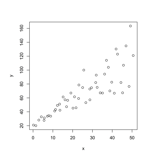
A good place to start is the vanilla scatter plot. Here is the R default:

Scatter default in R

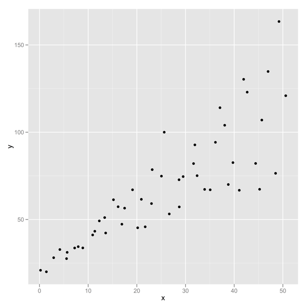
Compare it with the ggplot2 default:

Scatter with ggplot2 default

Below is the R code for comparison. (The data here are from hov.csv file used in Chapter 10 Example 10.2 of Serious Stats).

# install and then load the package
install.packages('ggplot2')
library(ggplot2)

# get the data
hov.dat <-  read.csv('http://www2.ntupsychology.net/seriousstats/hov.csv')

# using plot()
with(hov.dat, plot(x, y))

# using qplot()
qplot(x, y, data=hov.dat)

R code formatted by Pretty R at inside-R.org

Adding a line of best fit

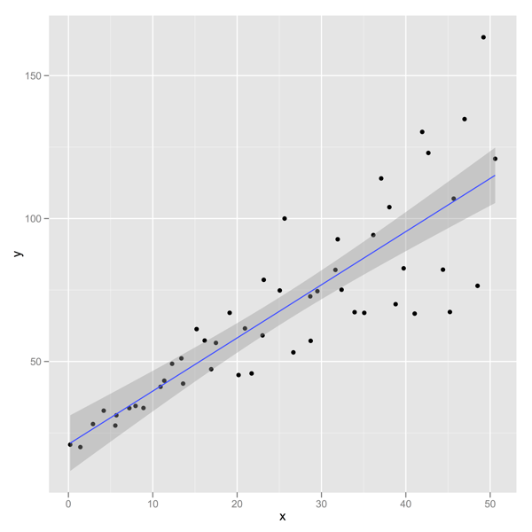
The ggplot2 version is (in my view) rather prettier, but a big advantage is being able to add a range of different model fits very easily. The common choice of model fit is that of a straight line (usually the least squares regression line). Doing this in ggplot2 is easier than with basic plot functions (and you also get 95% confidence bands by default).

Here is the straight line fit from a linear model:

Linear modelPOST

qplot(x, y, data=hov.dat, geom=c(‘point’, ‘smooth’), method=’lm’)

The geom specifies the type of plot (one with points and a smoothed line in this case) while the method specifies the model for obtaining the smoothed line. A formula can also be added (but the formula defaults to y as a simple linear function of x).

Loess, polynomial fits or splines

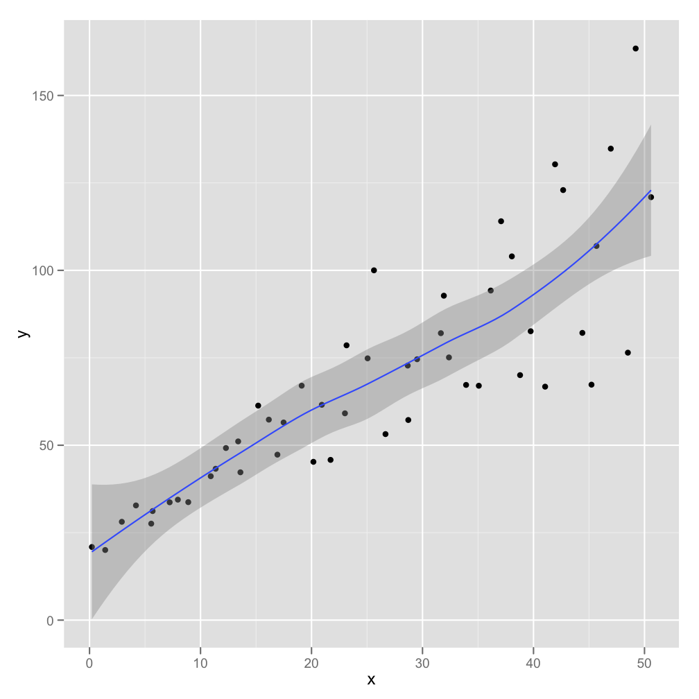
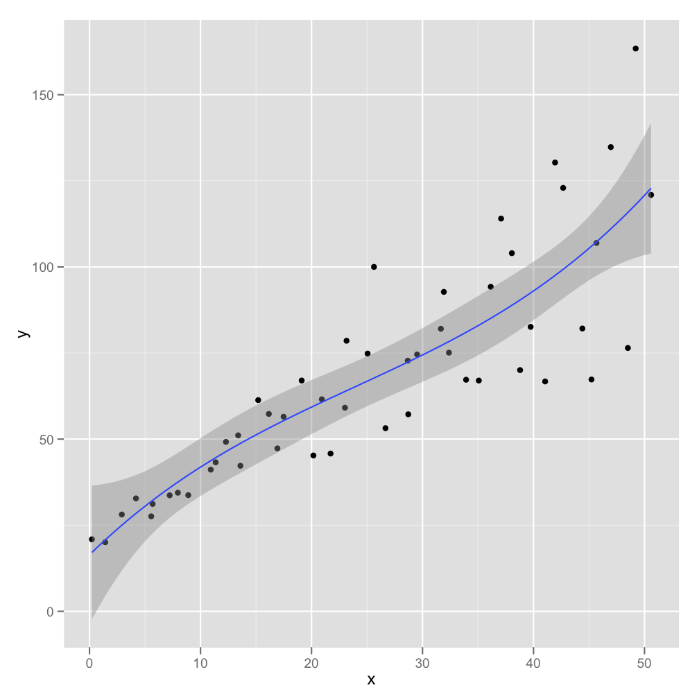
Mind you, the linear model fit has some disadvantages. Even if you are working with a related statistical model (e.g., a Pearson’s r or least squares simple or multiple regression) you might want to have a more data driven plot. A good choice here is to use a local regression approach such as loess. This lets the data speak for themselves – effectively fitting a complex curve driven by the local properties of the data. If this is reasonably linear then your audience should be able to see the quality of the straight-line fit themselves. The local regression also gives approximate 95% confidence bands. These may support informal inference without having to make strong assumptions about the model.

Here is the loess plot:

loess plot.png

Here is the code for the loess plot:

qplot(x, y, data=hov.dat, geom=c(‘point’, ‘smooth’), method=’loess’)

I like the loess approach here because its fairly obvious that the linear fit does quite well. showing the straight line fit has the appearance of imposing the pattern on the data, whereas a local regression approach illustrates the pattern while allowing departures from the straight line fit to show through.

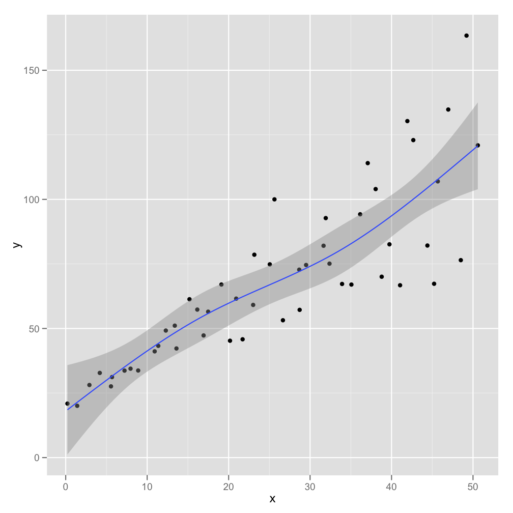
In Serious Stats I mention loess only in passing (as an alternative to polynomial regression). Loess is generally superior as an exploratory tool – whereas polynomial regression (particularly quadratic and cubic fits) are more useful for inference. Here is an example of a cubic polynomial fit (followed by R code):

cubic fit.png

qplot(x, y, data=hov.dat, geom=c(‘point’, ‘smooth’), method=’lm’, formula= y ~ poly(x, 2))

Also available are fits using robust linear regression or splines. Robust linear regression (see section 10.5.2 of Serious Stats for a brief introduction) changes the loss function least squares in order to reduce impact of extreme points. Sample R code (graph not shown):

library(MASS)
qplot(x, y, data=hov.dat, geom=c(‘point’, ‘smooth’), method=’rlm’)

One slight problem here is that the approximate confidence bands assume normality and thus are probably too narrow.

Splines are an alternative to loess that fits sections of simpler curves together. Here is a spline with three degrees of freedom:

spline fit 3.png

library(splines)
qplot(x, y, data=hov.dat, geom=c(‘point’, ‘smooth’), method=’lm’, formula=y ~ ns(x, 3))

A few final thoughts

If you want to know more the best place to start is with Hadley Wickham’s book. Chapter 2 covers qplot() and is available free online.

The immediate pros of the ggplot2 approach are fairly obvious – quick, good-looking graphs. There is, however, much more to the package and there is almost no limit to what you can produce. The output of the ggplot2 functions is itself an R object that can be stored and edited to create new graphs. You can use qplot() to create many other graphs – notably kernel density plots, bar charts, box plots and histograms. You can get these by changing the geom (or by default with certain object types an input).

The cons are less obvious. First, it takes some time investment to get to grips with the grammar of graphics approach (though this is very minimal if you stick with the quick plot function). Second, you may not like the default look of the ggplot2 output (though you can tweak it fairly easily). For instance, I prefer the default kernel density and histogram plots from the R base package to the default ggplot2 ones. I like to take a bare bones plot and build it up … trying to keep visual clutter to a minimum. I also tend to want black and white images for publication (whereas I would use grey and colour images more often in presentations). This is mostly to do with personal taste.